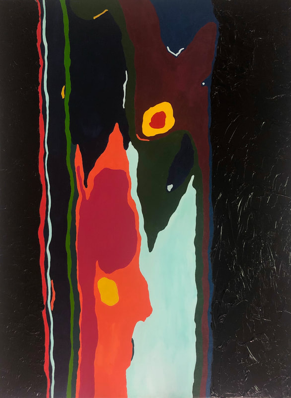
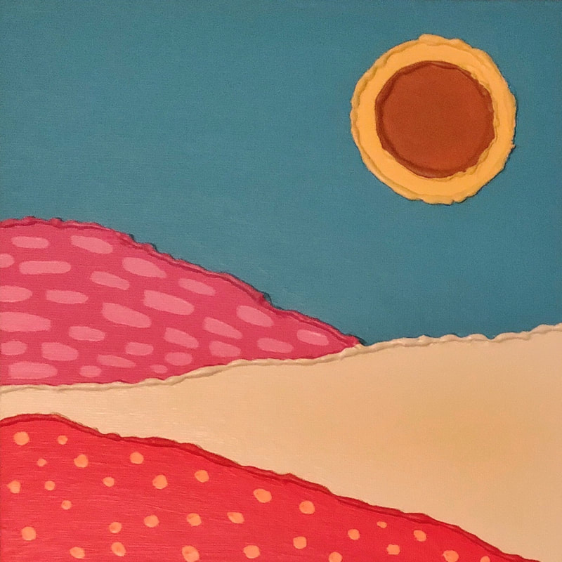
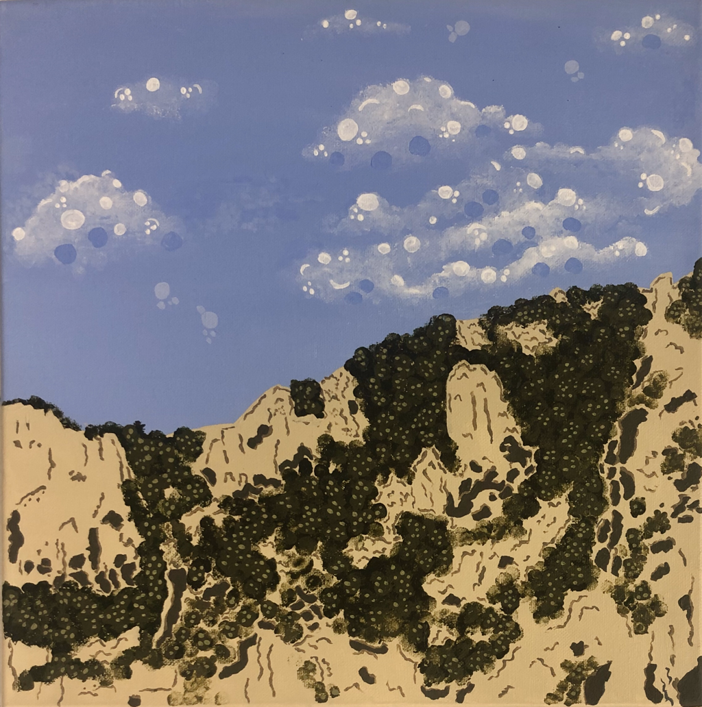
“Somewhere in Italy”
Acrylic on canvas
14” x 14”
With this painting, I wanted to depict the landscape from Italy in a more design-oriented style. I intended to simplify the complex landscape and break it down into its main colors, shapes, and minor textures. I also incorporated more design aspects including the dots in the clouds and sky that aren't in the original image.
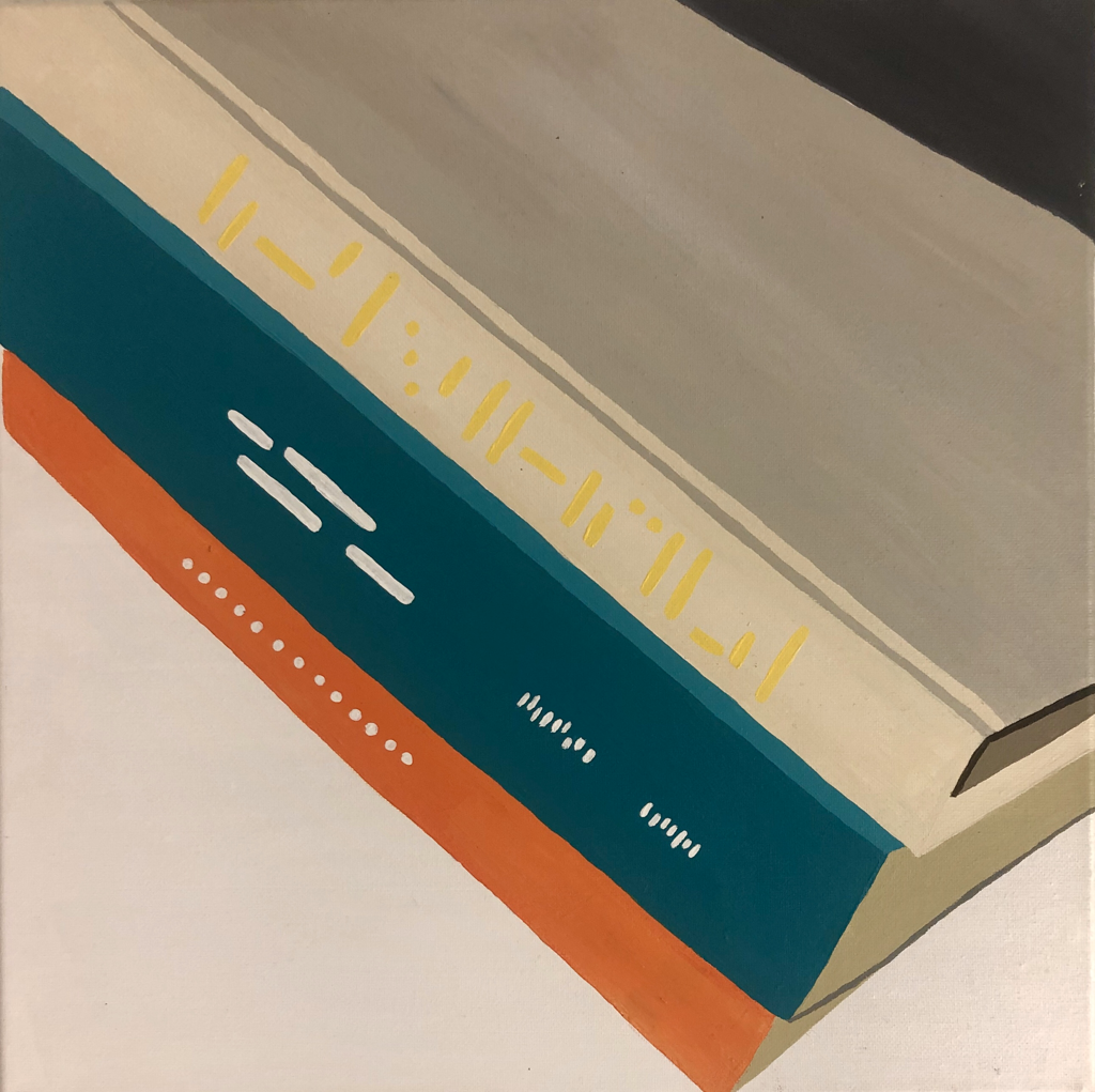
“Books”
Acrylic on canvas
14” x 14”
When taking the image for this painting I wanted to be sure I got an interesting composition and crop of the books in a way that you could still tell they were books but it didn't jump out right away as that. I specifically chose these books to include because of their colors and how they complement each other. My goal was to make it very simplified and in a blocky, design style. I did this by breaking it down to the simple areas of overall color and not including blended values. I purposefully did not attempt to make the writing on the spines of the books look real in order to keep in line with the simple, design style.
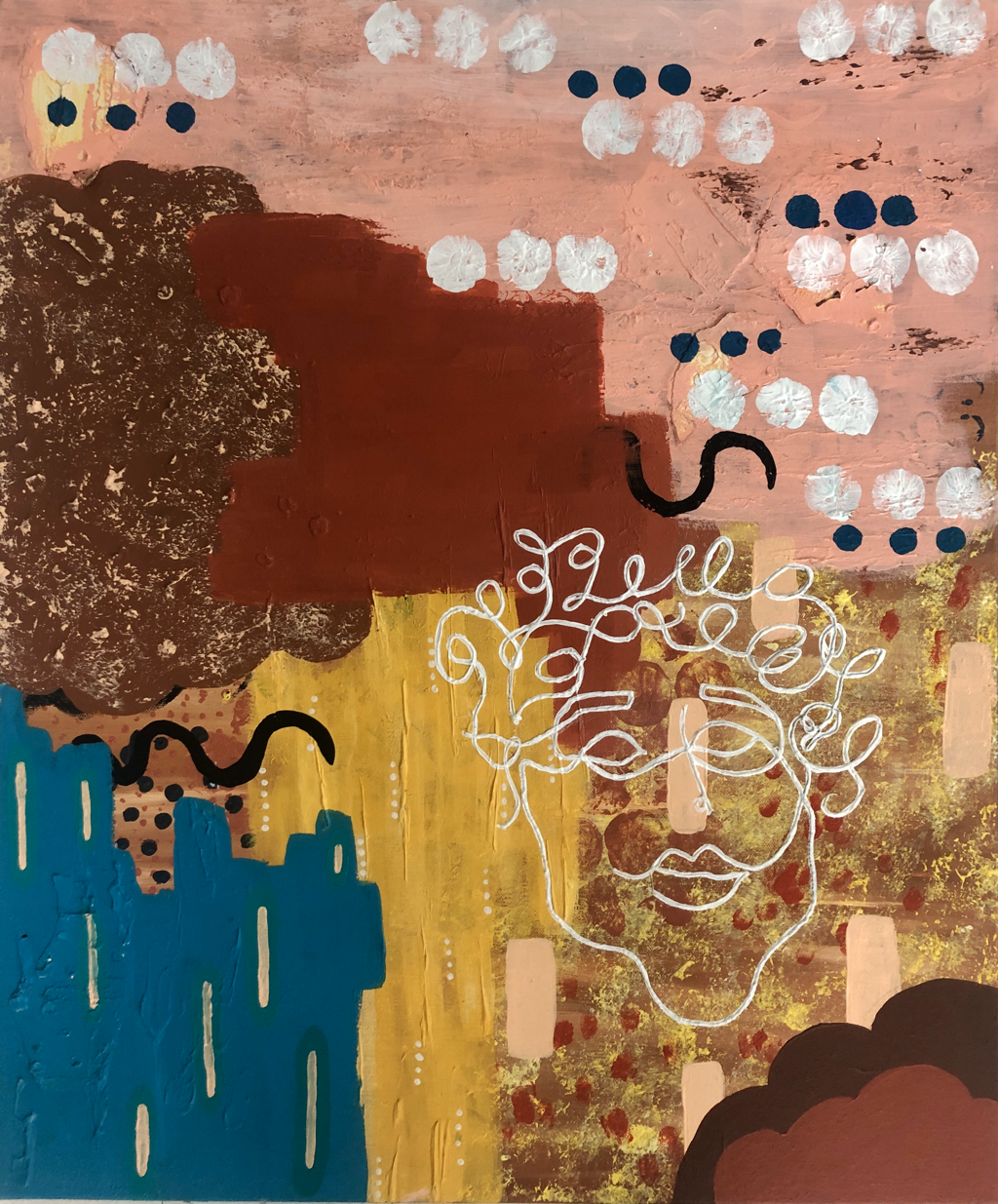
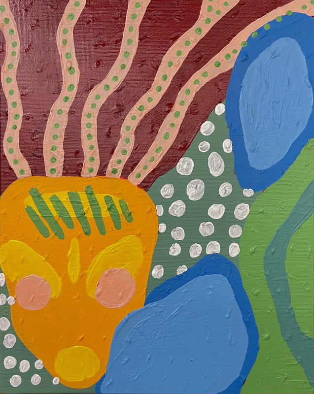
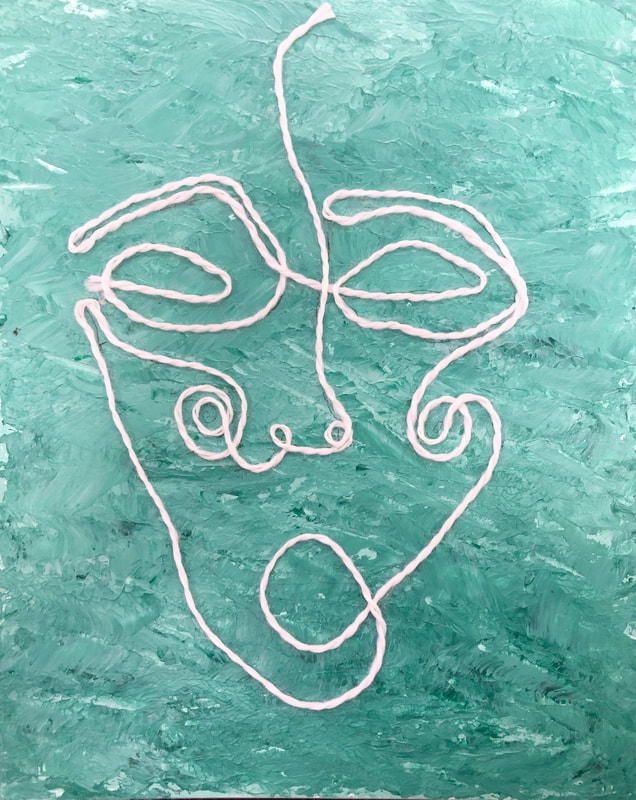
“In the Midst of Chaos”
Acrylic, molding paste, paper and 3-D pen on canvas.
20” x 24”
For this painting, my focus was more on combining various techniques to create texture and color in a cohesive manner that was appealing to the eye. I used molding paste and paper to make the textures on the bottom and used the acrylic paint to then layer on top in an abstract manner to create a fun background. I then decided to pair the busy background with a simple one-line face drawing with a 3-D pen to focus the composition onto one point so it is easier on the viewers eyes.
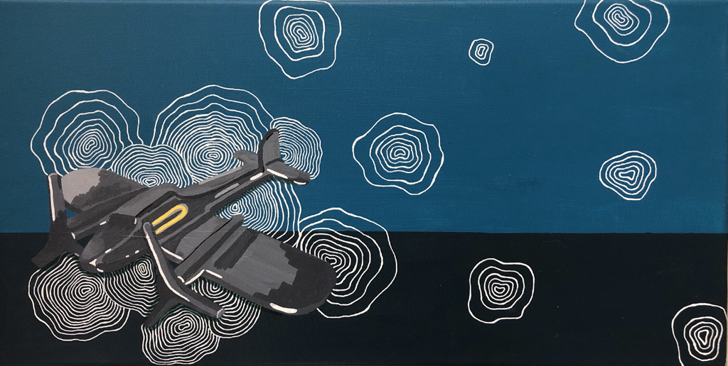
“Searching”
Acrylic and white gel pen on canvas
10” x 20”
For this painting my goal was to create an extremely design-oriented composition with the incorporation of a singular still life object. The object chosen was a reflective mirror color, so I decided to depict that aspect of the object using blocky, unblended values to emphasize the reflections. I chose to use the radar lines to move the viewers eyes across the canvas because they fit along with the theme of an airplane and they provided and interesting pattern.
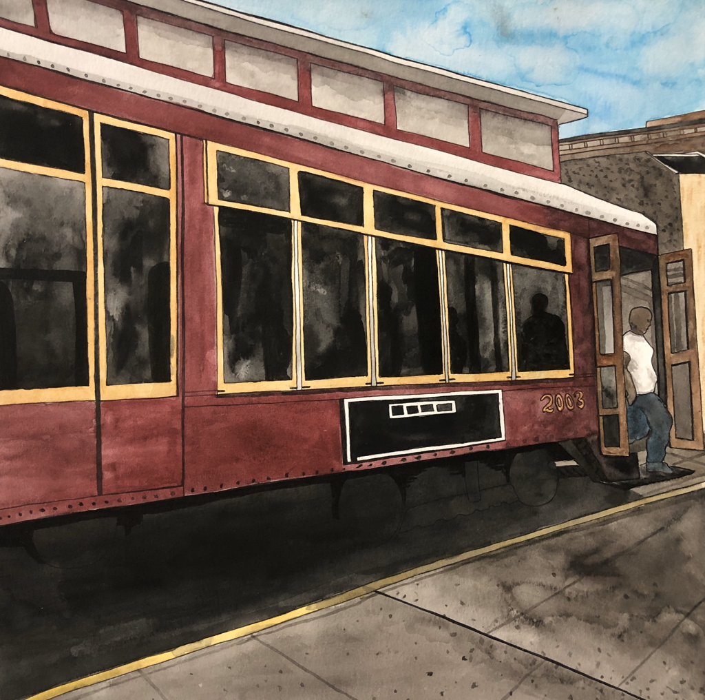
“N.O.L.A.”
Watercolor, copic pen, and india ink on watercolor
10” x 10”
This painting was inspired by an image I took of a trolley while driving down a street in New Orleans. I loved the colors in the image and the unique composition of the trolley. The focus of this painting was to successfully and accurately show the architectural aspects of the trolley on a street in New Orleans. I took a lot of time to make sure the lines, perspective, and proportions were accurate.
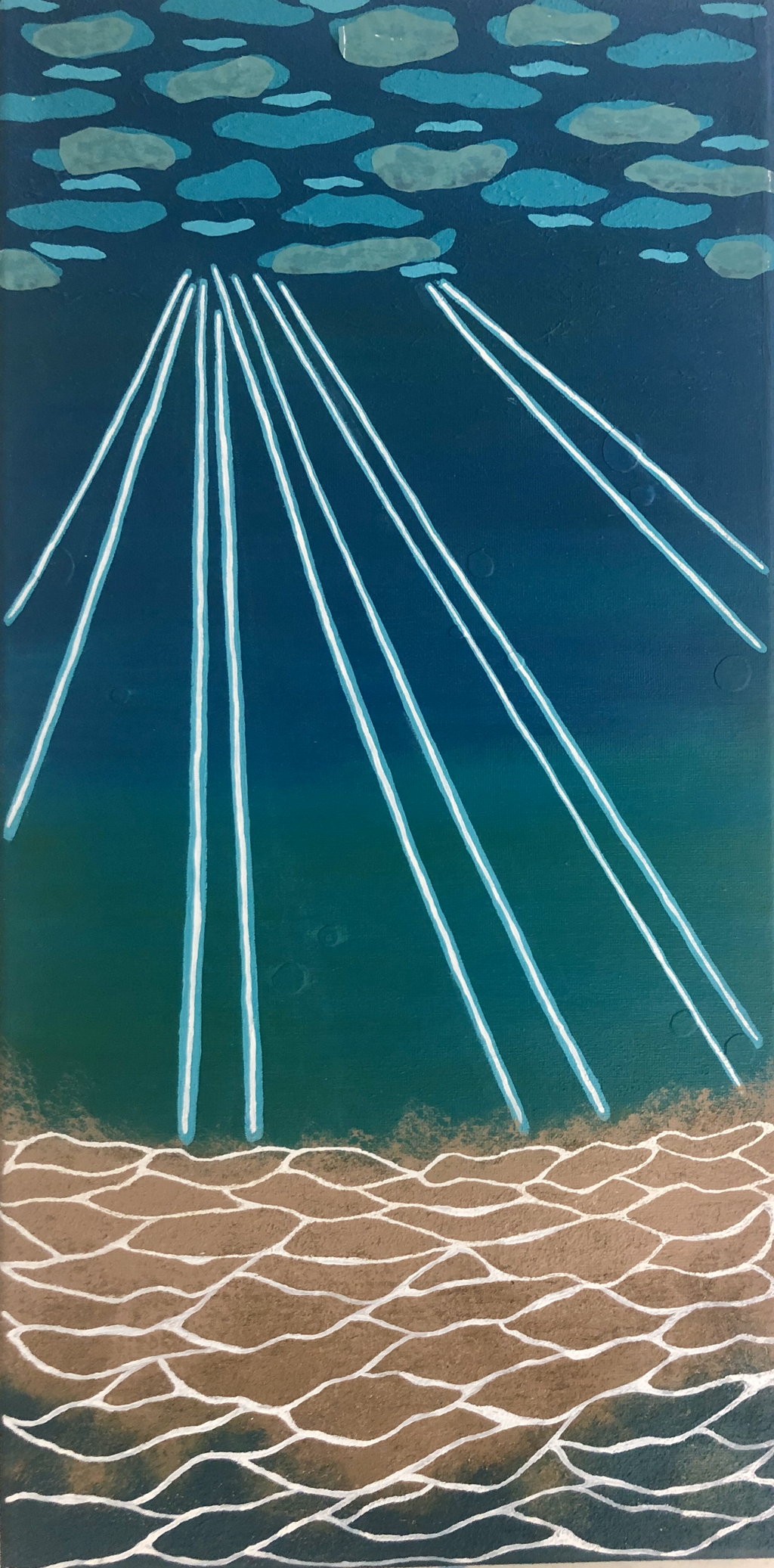
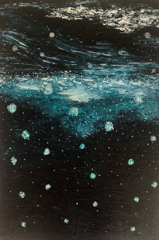
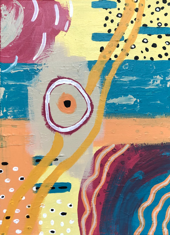
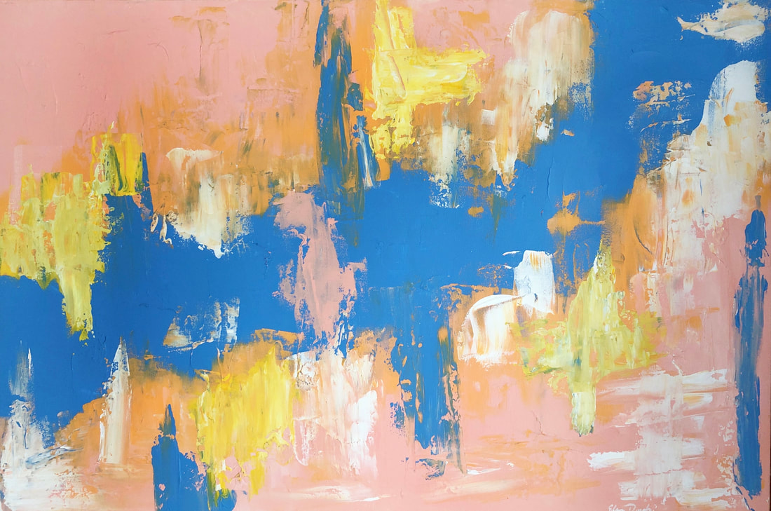
“Design of the Depths”
Acrylic, sand, molding paste. and plastic bag on canvas
10” x 20”
This painting was inspired by a few images I gathered from online that were different pictures of the ocean from underwater. I was inspired by the shapes the light and waves created on the top of the water and the shapes created in the sand by the moving light. I intended to make a design that really emphasized these shapes. I felt that the sand underneath and the plastic layers on top added a new layer of dimension to an otherwise flat design.
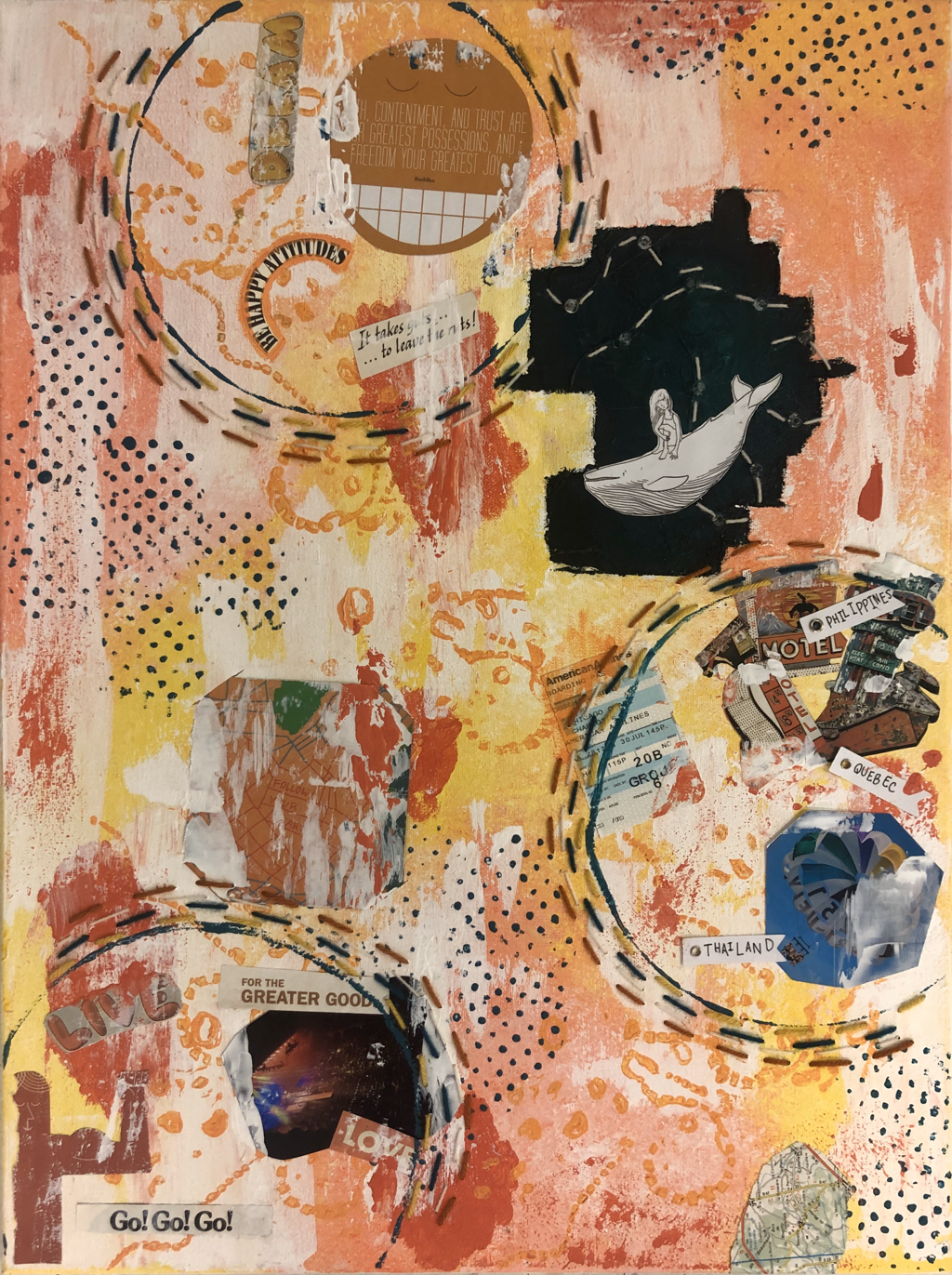
“A Head Full of Dreams”
Acrylic, magazine cut outs. yarn, book pages, photographs, labels, beads, ticket and maps on canvas
18” x 24”
This collage is supposed to represent the dreams and aspirations that I have for my future self. I have a "section" that shows the mindset I hope to be in with hope and happiness. I have a "section" that shows my desire to travel a lot, and I have a "section" that shows my desire to go on adventures and work hard in life. The colors were inspired by colors I am drawn to and colors that my friends said they thought of me as.
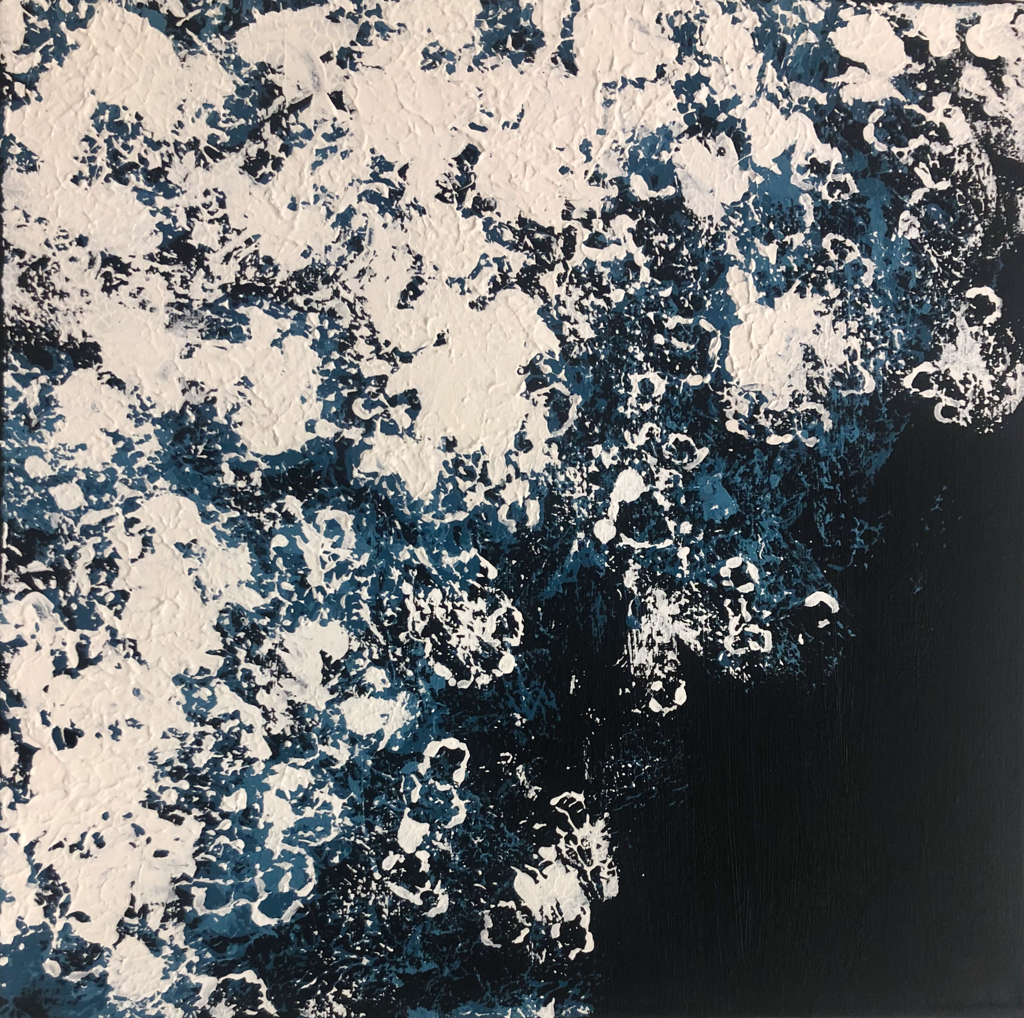
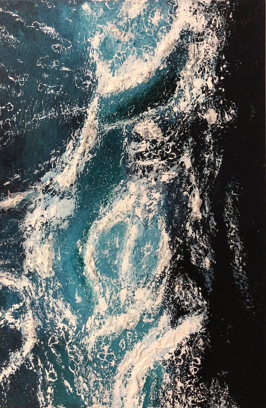
“Up Close and Foamy”
Acrylic and gel medium on canvas
12” x 12”
This painting was inspired by a compilation of different images of waves in the ocean. I created a composition that was more cropped in to show the different colors and textures you see in the water when waves are breaking. I also made it more about the design by going in with a detail brush to add in specific shapes to the water.
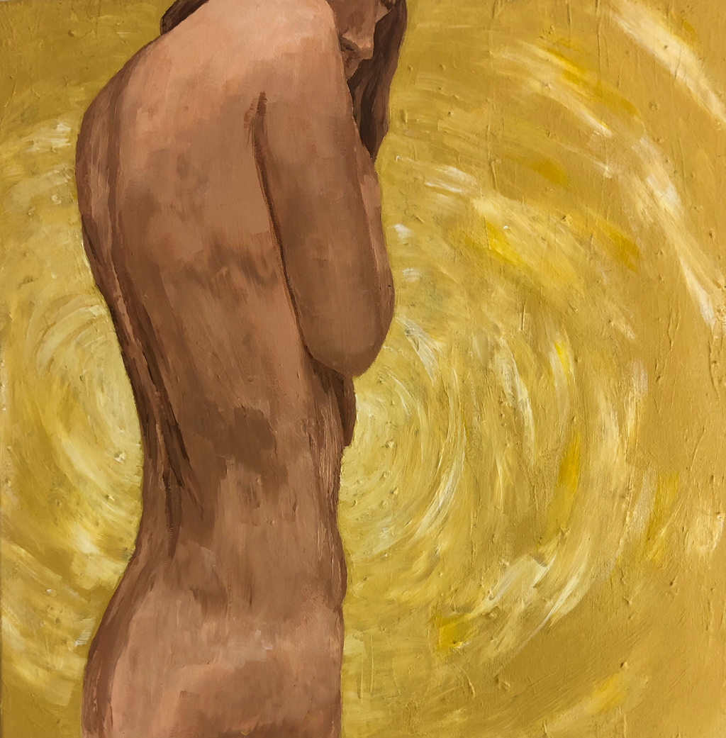
“Emit Light”
Acrylic and matte medium on canvas
12” x 12”
For this painting, my goal was to accurately create a figure in an expressionist paint style with the paint strokes visible and the values not fully blended. At first, the background was a wall of abstract-looking vines that crossed over her body, but then I decided to redo it and change the background to this yellow color. I wanted to make it look almost like a sun behind her, or as if there was light being emitted from her, giving the idea of a girl who emits light and makes people happy. I was inspired by Van Gogh's style of painting.
Sustained Investigation For AP Studio Art 2020
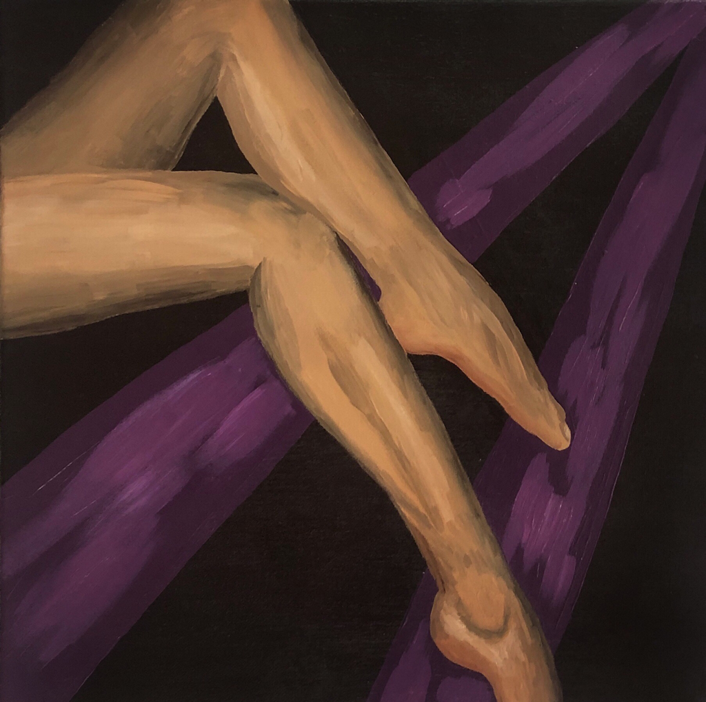
“CONFIDENCE”
Acrylic on canvas
14” x 14”
The figure’s position, the crosses legs and pointed toes, is meant to give off a confident mood/feeling. It is supposed to show that the figure is a confident person just by looking at their legs. I cropped out the rest of the body from the composition to keep the focus on the legs and their attitude. I specifically chose the dark purple as the background color to further show the confidence, given that purple typically symbolizes royalty.
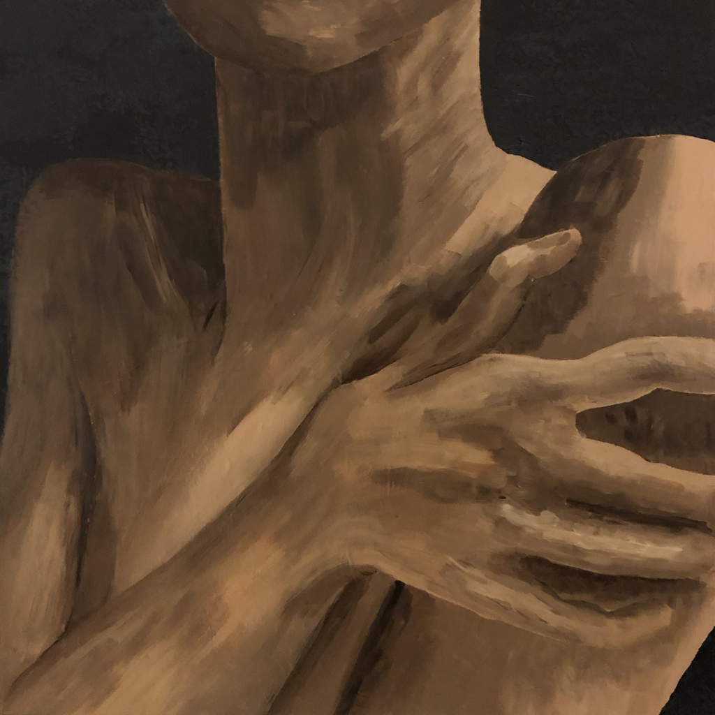
“ANXIETY”
Acrylic on canvas
14” x 14”
This piece is a cropped-in composition of tensed up shoulders and a hand grabbing them that shows the person as being stressed. This piece is meant to focus on how how the tense shoulders can show that someone is feeling stressed or anxious. I made the background a dark grey with small, black scribbles that show chaos and stress as well. I painted the body in an expressive style with dramatic and un blended strokes.
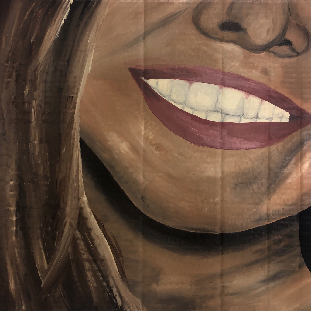
“HAPPINESS”
Acrylic on cardboard
20” x 20”
This artwork is meant to convey happiness through the mouth. I chose a picture of me genuinely smiling and cropped in to have mostly the mouth and just a small part of the nose in the composition. I did this in order to focus on the smile and the emotion the mouth is conveying.
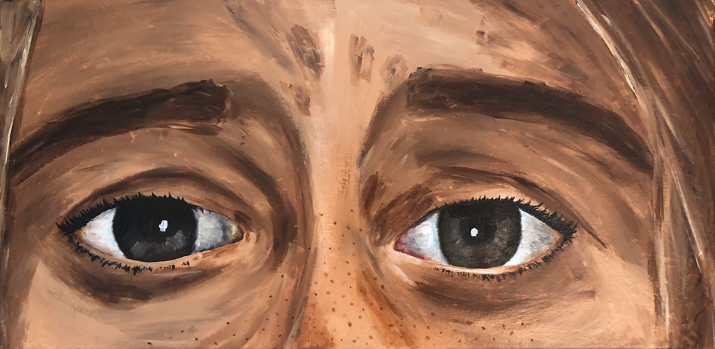
“SADNESS”
Acrylic and clear varnish on canvas
10” x 20”
This artwork is meant to focus on how the eyes convey sadness. I originally painted the eyes with a wider composition and I included a blue, glossy texture on the sides to add a design element that further emphasized the sadness. However, I was unsatisfied with the end result and decided to repaint the eyes using a slightly more expressive reference photo with a more zoomed-in composition. I made sure to use more expressive and I blended brushstrokes and used a larger variety of colors to add more dynamic and depth. The expressive brushstrokes. further emphasize the lines surrounding the eyes that show the feeling of sadness. I decided not to add in the same blue texture as before because I thought the new expression was enough to convey the sad emotion and kept it more sophisticated and simple.
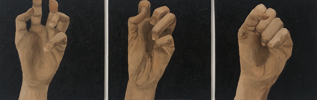
“FRUSTRATION”
Acrylic and gel medium on canvas board
8” x 24”
This is a mini series in my investigation that explores how the hand can convey frustration through its clenching. I decided to make it a series of three pieces to show to transition of the hand clenching into a fist in three different positions. I made the background using an impasto technique with gel medium to add to the jagged, angry tone of frustration. I painted over it black to keep the background more simple so that the focus would be on the lines and folds of the hand. I also thought black was an accurate color that conveyed frustration given its negative connotation and tone.
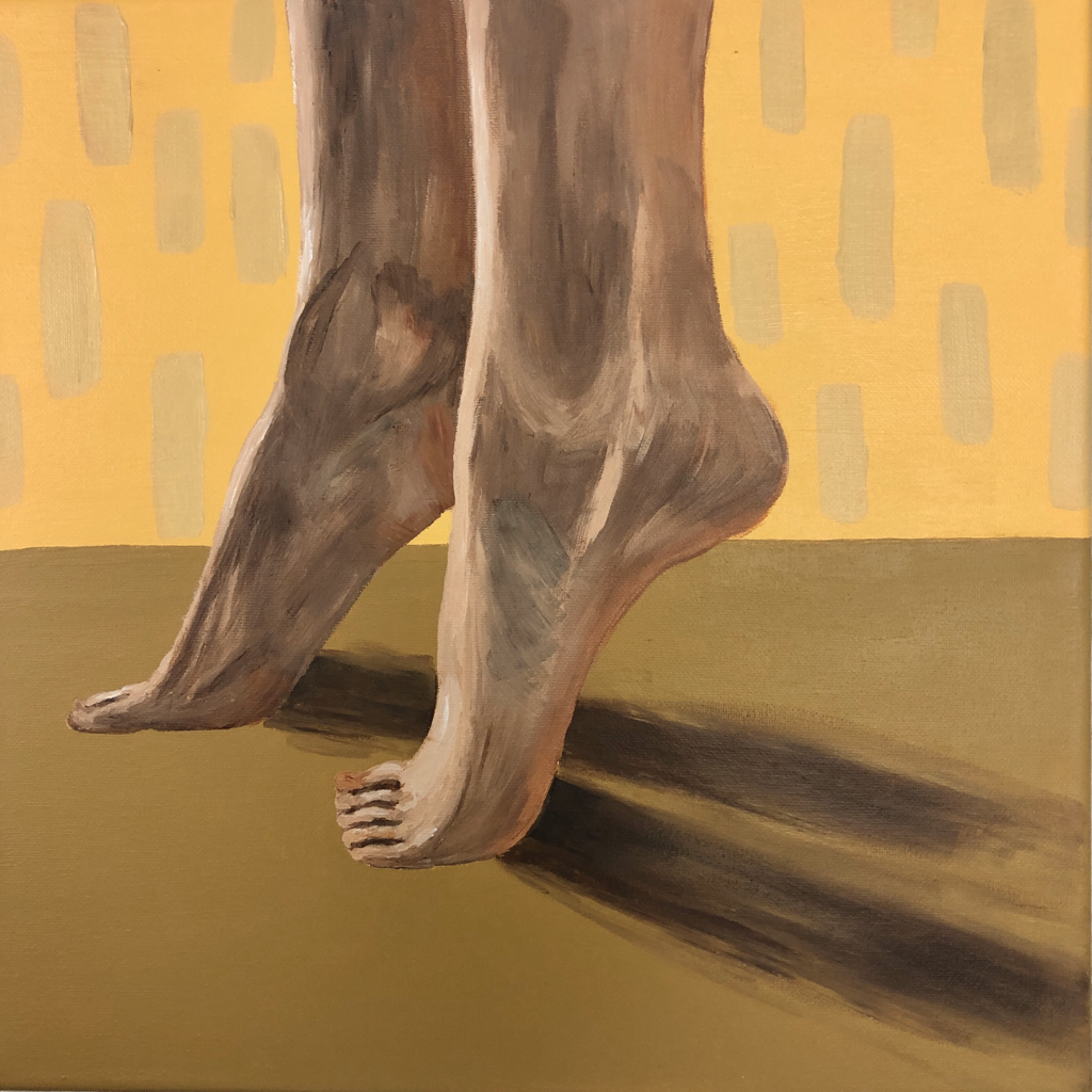
“CURIOSITY”
Acrylic on canvas
14” x 14”
This piece is meant to to focus on how the feet can convey curiosity. I took the reference photo of my feet standing on their tip toes and cropped in on just the feet and ankles to focus on that position. I chose this position to insinuate that the person is standing on their tip toes to reach and see something, to show curiosity in seeing something. I made sure to use expressive brushstrokes when painting the feet and the various shades on the feet. I chose to make the background two different tones of yellow because I felt that yellow was a more childish color and I associate curiosity with children. I wanted to keep it more design oriented and simple so I left it at two tones to create some sense of depth. I added in simple but expressive brushstrokes for the shadow of the feet. Lastly, I painted a simple pattern on the lighter yellow to add in more interest and create a more lighthearted tone, as associated with curiosity.
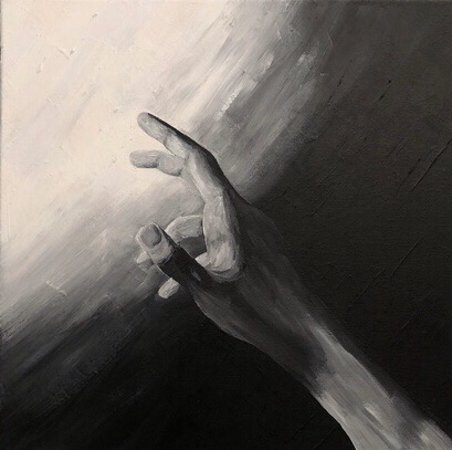
“LONGING”
Acrylic on canvas
14” x 14”
This painting explores how the hand can convey the emotion of longing. I decided to paint the hand in black and white to try out a new skill and I felt that longing was the best emotion to experiment black and white with because the emotion of longing seems to imply that you are missing something, something like color, that makes you complete and happy. I took the reference image in black and white to get the accurate shades when painting. I made my hand look as if it is reaching sadly for something. I tested out background ideas using a photo editing app. I came up with the idea of thick blocks of color moving from black and white and grey into bright colors in the direction that the hand is reaching towards. This insinuates that the hand is reaching from the grey life of its own to a something more bright and happy. However, I was unsatisfied with the final product because I felt that it looked unsophisticated and childish. I decided to paint over it with a black and white gradient. This gradient has the same reasoning as the color blocks, just instead of reaching from black and white to color the hand is reaching from black to white. The white represents something brighter and more hopeful. I felt that the gradient was more simplistic and sophisticated.
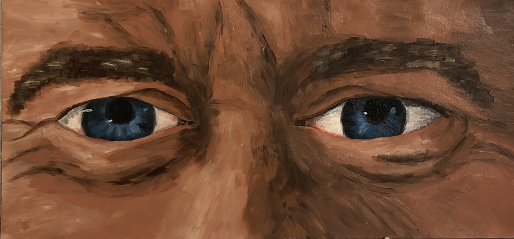
“CONTEMPLATION”
Acrylic and matte medium on watercolor paper and mat board
9” x 19”
This piece explores emotion in an older person. It focuses on how the eyes convey contemplation and deep thought. I used my dad as the model for my reference photo. I cropped in on mostly just the eyes to keep the focus on them and the lines surrounding them. I used very expressive and unblended brushstrokes to emphasize the texture and lines of the skin surrounding the eyes. These lines are vital to showing the contemplation and deep thought that he is in. Learning from my last eye painting, I made sure the start with the actual eyeballs first and use a lot more variety of colors in them and make the shadows deeper than I think they might be to show the true depth and roundness of the eyes. I decided to not add any extra design element on top to keep the piece focused on just the eyes and how the lines and folds in the skin express the emotion.
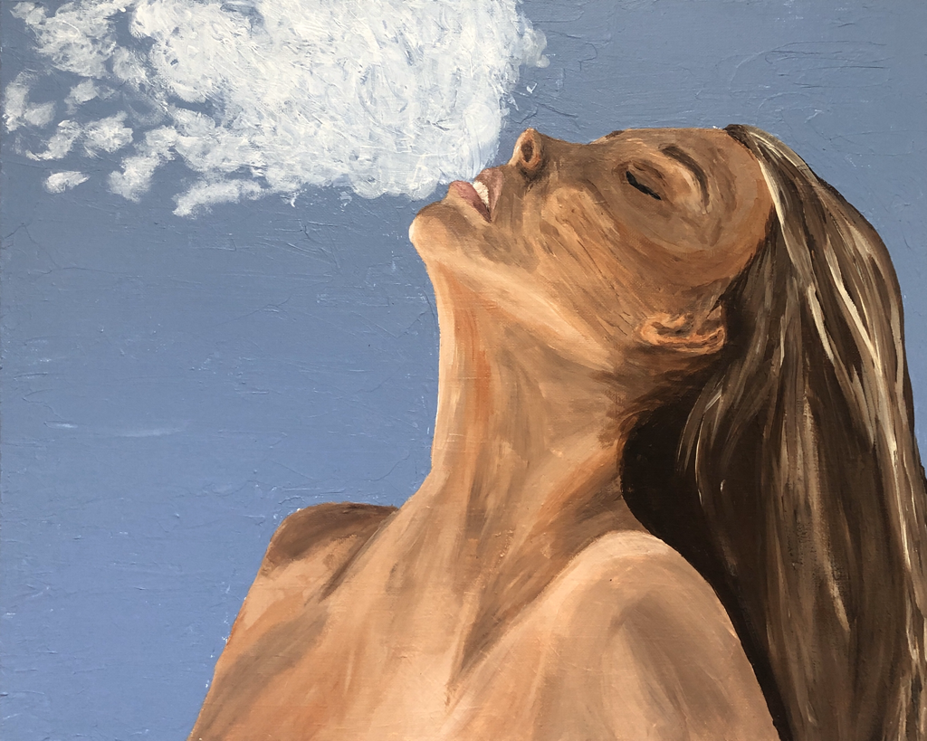
“RELIEF”
Acrylic and gel medium on canvas
16” x 20”
This piece is exploring how the combination of the shoulders, neck and mouth can show relief. I was inspired by an image by Jackson Carvahlo. I recreated my own version of the image with my own body. I spent a lot of time sketching out the image on my canvas to ensure it was accurate and proportionate. I then went into the background using an impasto technique with gel medium. I decided to use a light blue because it evokes a sense of serenity. I wanted the background to be very simple so that the focus was on the person’s body and the sigh of relief. I then went in a painted the body and hair using expressive brushstrokes and making sure not to blend the colors too much. I decided to add in white coming out of the mouth to look like a sigh. I thought it would further convey the idea of relief since people typically give a “sigh of relief.”
